Nissan Z: Meet Designers Naoyuki Ohkoshi and Takuya Yamashita
Designer Genes
We journey further into the design story of the all-new Nissan Z by sitting down with exterior designer Naoyuki Ohkoshi and interior designer Takuya Yamashita, to gather their personal insights on the Z’s fresh look.
Ohkoshi joined the Nissan design team in 1997. Notable past projects in his portfolio include the 2009 INFINITI QX60 and the 2012 QX80, as well as projects with Daimler and supplier Magna. Yamashita is a newer member of the Nissan global design team, coming on board just four years ago. He’s already raising eyebrows and exceeding expectations with his interior design touches.
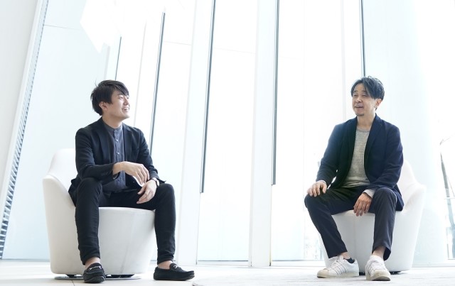
Q: How did you feel when you were chosen for the team to design the all-new Z?
Ohkoshi: I was really happy. It’s a great opportunity to design such an iconic car. Of course, it was not just me, it was a team effort as with all our vehicle designs. Actually, I didn’t feel worried or nervous with the design because I was having so much fun. Of course, I felt a lot of pressure to get it right for fans around the world.
Yamashita: To be chosen to design the Z, a car that I admired and loved since my childhood, was an honor and it made me very happy. I definitely felt a high level of responsibility, as the Z is considered a Nissan icon. By showing the utmost respect to the history of the car and to those who helped build the Z into what it is today, I wanted to create the best design yet.
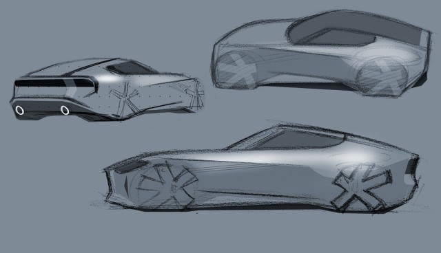
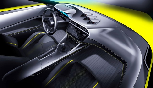
Q: Was the Z designed exclusively by Nissan’s Japanese design team or was there an opportunity for global teams to participate? And which design came first, the exterior or interior?
Ohkoshi: There was a global design competition where various design teams from Japan, China, the U.S. and the UK submitted sketches. About 100 were submitted, with the round of selections rendered as 3-D data models. From those, three finalists were chosen and made into full-size clay models. Once these were completed, our executives studied each design carefully and chose a winner, which turned out to be the entry from the Japan team.
Yamashita: After the exterior shape and key proportions were worked out, the interior design process began. Initially, the interior of the Z was meant to be a simple evolution of the current Z’s interior. However, we decided to go in a different direction after some input from our executives: They were Z fans and wanted the model to be equally great inside and out. The original interior design would have been a simpler task, but they did not want to compromise anything with this car. This made me very happy.
Q: Were there any particularly difficult parts of the vehicle to design?
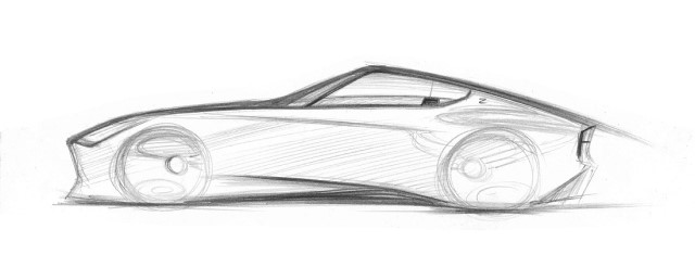
Ohkoshi: Absolutely! The placement of the side character line that Irie-san alluded to in a previous interview was something that looks clean and simple, but dictated the whole flow of the car. If we adjusted it a bit, it meant we had to re-think other areas as well. There were so many sketches made, drawing the Z is like muscle memory for me now.
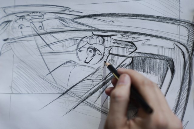
Yamashita: I would have to say that getting the center console dialed in was the most difficult part of designing the interior. In the current 370Z model, the center console bends, rising as it moves toward the driver. With the Z, we wanted to make it straight and level, acting like a strong beam or support that enhances the Z’s rear-wheel-drive sports car spirit. The console shape appears very simple, but in fact, it’s surrounded by several interior elements, including the seats and a number of moving parts such as the shifter and parking brake, so trying to implement a more level design here proved extremely difficult. In fact, it took six months alone to get the design from 95 percent complete to 100 percent complete.
Q: In previous Z-ness stories, we’ve learned about some of the influences the original Z (S30) and other past models have had on the Z’s design. As the designers responsible for the overall look of the all-new Z, inside and out, what are your thoughts?
Ohkoshi: I thought that the latest Z should have an appearance that made anyone looking at it and say, “It’s a Z!” And, if you study past models, the design DNA of the original Z (S30) has been noticeably implemented in other generations of Zs as well. For example, the shape of the side window in the current 370Z. This is a form of paying respect and, I therefore feel that the Z’s side-window graphics pays homage to both the original Z and the 370Z. In addition, it was important to convey the original Z’s silhouette with this car – with classic lines flowing from the roofline and dropping over the rear glass hatch – to give people a feeling that it’s a Z without even seeing the emblem.
Yamashita: For the interior, one design cue that was inspired by the S30 Z was what we call the “reverse slant.” This refers to the top of the center dash where the air vents are located. The angle here goes in the opposite direction of the bottom portion of the dash, hence the name. What this does is it reduces the “visual noise” in the driver’s line of sight, resulting in an interior where the driver feels safe and secure even while traveling at high speeds. The S30 Z has a unique center dash layout; at the very top of the dash are three gauges, located at about the driver’s eye level. Immediately below them are the center air vents, and underneath those are the controls for the ventilation and audio systems. We wanted to retain this stacked layout in the Z because it’s not found in many other cars. In particular, I feel that the cabin provides an authentic sports car flavor that’s approachable as a daily driver, much like the interior of the 300ZX (Z32).
Q: Which past Zs are your personal favorites?
Ohkoshi: I must say the very first Z, the S30, but I also like the Z32. When I was about three-years old, my father brought home a Nissan catalogue. There was a yellow Z on the cover, I think it was an S30, actually. From then on, I started drawing cars, it was like a switch. When the 300ZX (Z32) came out, I was still in school. I remember being floored at the thought that such a design could come from Japan.
Yamashita: When I was young, my father drove a Z31 (300ZX), and I have been a fan of the Z ever since. My drive to become an automotive designer was most likely due to the influence of my father and the Z. He also drove a Kenmeri Skyline (C110), but it was the Z I remember the most fondly. So, if you were to ask me which was my favorite Z, I would have to say it’s a tie between the S30 and Z31.
Q: Looking back on your work, what element on the Z are you most proud of?
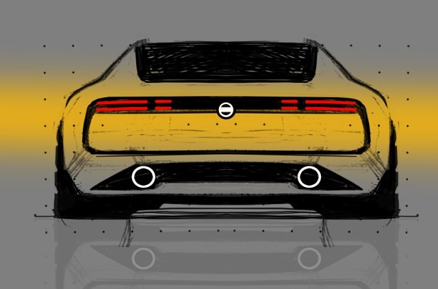
Ohkoshi: I feel that the rear end looks fantastic. It highlights the car’s slope-backed roofline and creates a solid stance, giving a romantic image that’s reminiscent of the S30, while still appearing very modern. It was quite a battle to pull this off, shedding and shifting millimeters. but, as I said, when you see it, you can’t help but say, “That’s a Z. No question.”
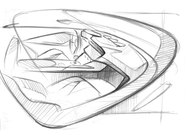
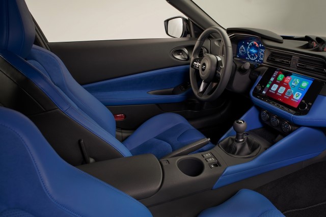
Yamashita: I’m particularly fond of the view of the dashboard and instrument panel from the passenger side. The top of the dashboard in front of the driver is shaped in a way that invites the flowing shape of the long hood directly into the cockpit. It’s kind of a hidden design that we unconsciously register but it provides a portal between the exterior and interior. It also highlights the unique cross-section of the dash. This was created with our clay modeler, Haruo Yuki.


